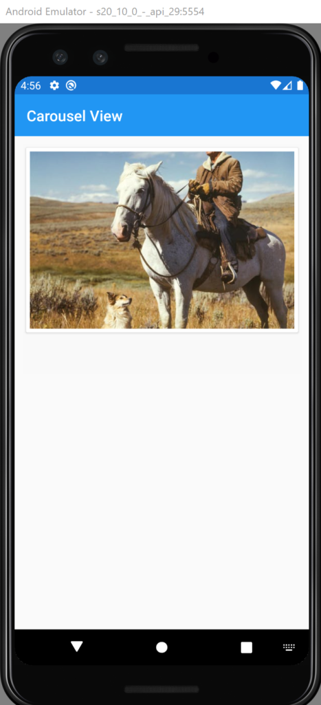
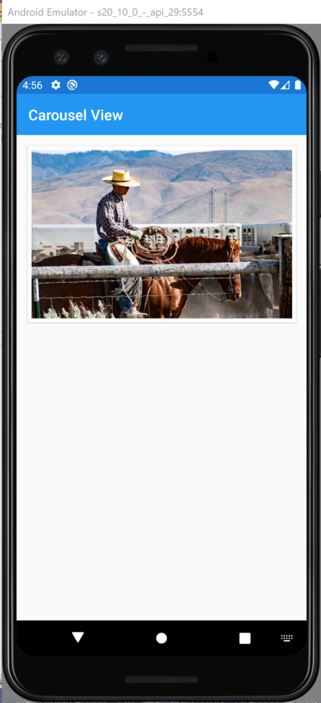
In this article, we will see the Carousel View component. The carousel is a slideshow for cycling through a series of content, it works with a series of images, text, or custom datatemplate . It also includes support for indicators.
Start by creating a new Xamarin Forms project. You will learn more by going through the steps yourself. If this is your first experience with Xamarin Forms, i recommend to read my previous Xamarin Forms posts in this section.
Add Carousel Code
First of all, let’s add the xaml code in MainPage.xaml. In general, you’ll need only to bind the ItemsSource property with your data list. It can be a simple list of images urls or complex data structure. In our case, we use a simple list of urls. So you code will look like this:
<?xml version="1.0" encoding="utf-8" ?>
<ContentPage xmlns="http://xamarin.com/schemas/2014/forms"
             xmlns:x="http://schemas.microsoft.com/winfx/2009/xaml"
             x:Class="CarouselView.Views.MainPage"
             Title="{Binding Title}">

    <Grid RowDefinitions="*,*">

        <CarouselView ItemsSource="{Binding ImagesList}"
                      Margin="10">
            <CarouselView.ItemTemplate>
                <DataTemplate>
                    <StackLayout>
                        <Frame HasShadow="True"
                               Margin="5"
                               Padding="5">
                            <Image Source="{Binding }"
                                   Aspect="AspectFill"/>
                        </Frame>
                    </StackLayout>
                </DataTemplate>
            </CarouselView.ItemTemplate>

        </CarouselView>
    </Grid>

</ContentPage>
In the other side, define a new property called ImagesList type of IEnumerable of string in your ViewModel.
Override the Initialize method in which
Run the application and you get a carousel view just like this:


Display indicators
In this paragraph, we will see how to display Carousel items indicator. Firstly, let’s add a new component called IndicatorView. Secondly, define the indicator color and the selected indicator color. Finlay, add the property IndicatorView to CarouselView tag and put the its name. So your code will look like this:
<?xml version="1.0" encoding="utf-8" ?>
<ContentPage xmlns="http://xamarin.com/schemas/2014/forms"
             xmlns:x="http://schemas.microsoft.com/winfx/2009/xaml"
             x:Class="CarouselView.Views.MainPage"
             Title="{Binding Title}">

    <Grid RowDefinitions="*,*">
        <StackLayout>
        <CarouselView ItemsSource="{Binding ImagesList}"
                      Margin="10"
                      IndicatorView="IndicatorView">
            <CarouselView.ItemTemplate>
                <DataTemplate>
                    <StackLayout>
                        <Frame HasShadow="True"
                               Margin="5"
                               Padding="5">
                            <Image Source="{Binding }"
                                   Aspect="AspectFill"/>
                        </Frame>
                    </StackLayout>
                </DataTemplate>
            </CarouselView.ItemTemplate>

        </CarouselView>
        <IndicatorView x:Name="IndicatorView"
                       IndicatorColor="LightGray"
                       SelectedIndicatorColor="Black"
                       HorizontalOptions="Center">

        </IndicatorView>
        </StackLayout>
    </Grid>
</ContentPage>

That’s all, for starting using carousel View in Xamarin forms. If you need more details on how to user interactions or making content refresh, you can find more information in Microsoft site web.
You can get the code from GitHub.
Follow Me For Updates
Subscribe to my YouTube channel or follow me on Twitter or GitHub to be notified when I post new content.
